Creating a Component
Any artboard can be converted to a component. To do so, select an artboard on the stage and use the component icon in the inspector to toggle its status. Alternatively, you can use theShift + N shortcut with an artboard selected. If you’re coming from Figma, then the Cmd/Ctrl + Alt/Option + K, shortcut will also work.
Select the component toggle in the inspector again to revert your selection back to a regular artboard, or use the Shift + Alt/Option + N shortcut.
Currently, only artboards that have been flagged as components will be exported to your .riv file. If you think you may want to programmatically access an artboard at runtime, you should mark it as a component. More options on specific export behaviors are coming soon.
Using Components
Use the Component Tool — formerly known as the Nested Artboard Tool — to select and place instances of a component on the stage. Select the tool from the toolbar or use theN shortcut to enable it.
Click anywhere on the stage to place the component in the desired location. A menu will display available components to instance. If none show up, you may have no artboards marked as components in your file.
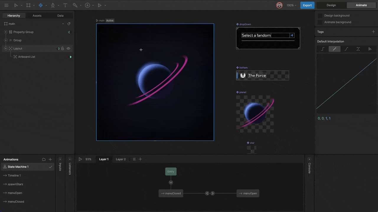
Configuring a Component Instance
Once you’ve added an instance of a component, select a timeline or state machine for playback.State Machines
After assigning an instance, the default state machine is displayed in the inspector.
Adding an Animation
You can playback any animation associated with a component. You’ll need to add the desired animation to the instance using the plus button in the Inspector.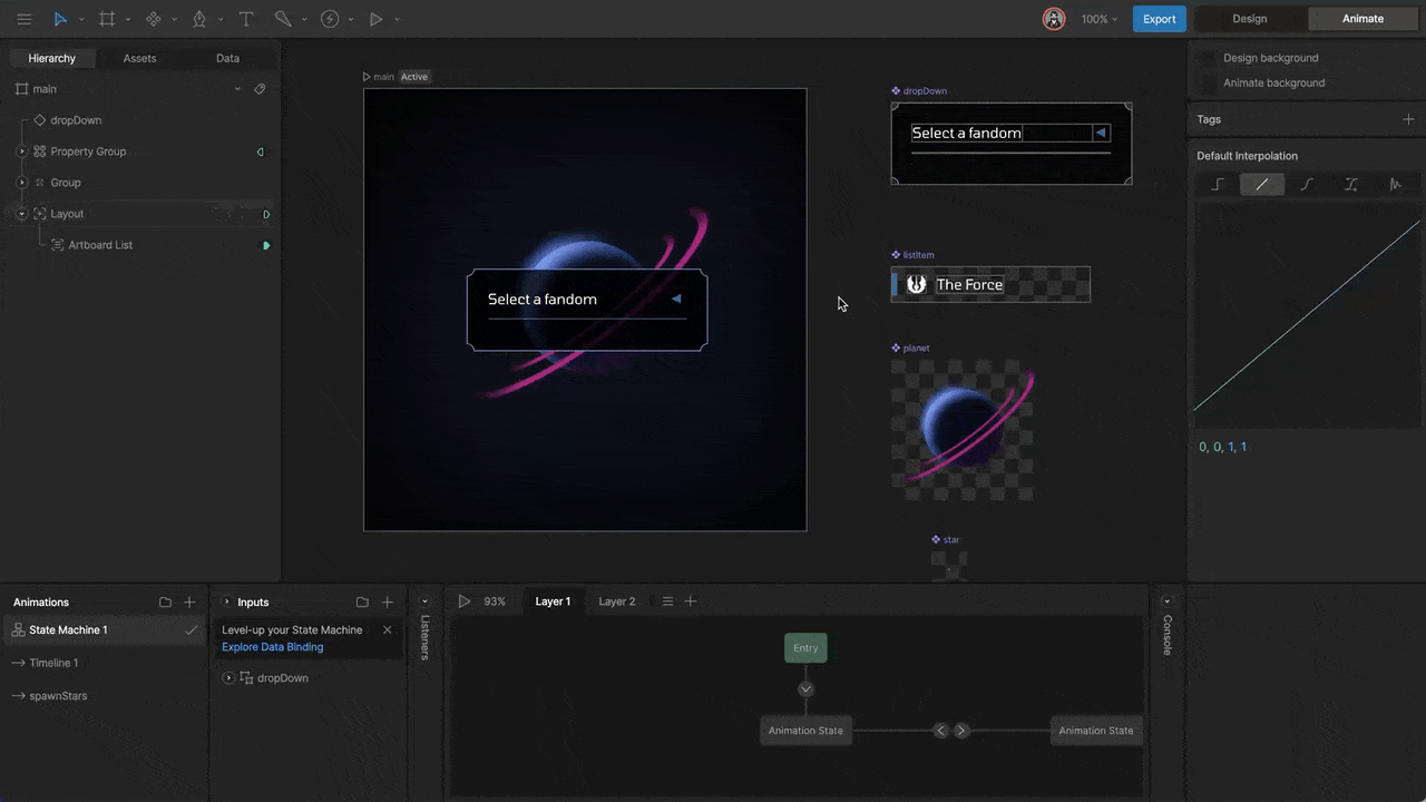
Simple
Simple animations are an easy way to playback a component’s timeline.
Remap
Remap animations allow you to key time values of an animation on the timeline. This lets you stretch, shrink, or even play an animation in reverse.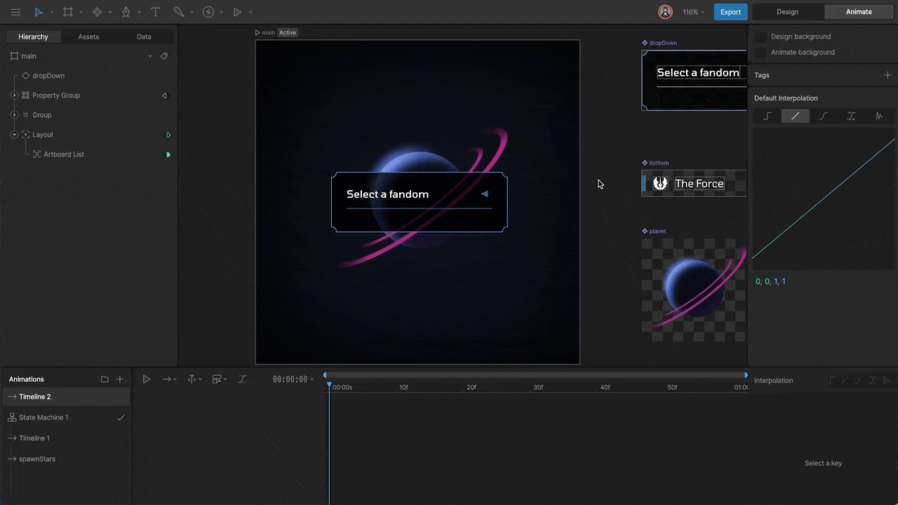
Mix Value
As you add additional animations to a Component, animations begin to mix together. This mixing is important, especially when multiple animations share keyed properties. Without adjusting this value, your Component may not playback your animations in the way you want. By default, any animation added to a component starts with a mix value of 100%. You can adjust this value in design mode or in a specific animation by setting keys. Note that an animation that has a non-zero mix value will always be mixing with other animations, regardless if it has a play key set or not. To ensure the correct animation is playing, ensure that you key the mix value for the desired animation to 100%, and all other animations have a mix of 0%.Instance Modes
Component instances can be set to use one of 3 modes which will behave differently based on their contents and the context in which they are used. The Leaf and Layout modes are typically used when the parent artboard needs to layout its contents responsively.Node
This is the default mode and is used in non-responsive scenarios. Its contents will always appear scaled (via the Scale property).Leaf
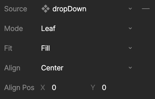
Leaf Fit
The Fit type determines how the Component Leaf will scale within its allotted area.- Fill (Default): Content will fill the available view. If the aspect ratios differ, then the Rive content will be stretched.
- Contain: Content will be contained within the view, preserving the aspect ratio. If the ratios differ, then a portion of the view will be unused.
- Cover: Rive will cover the view, preserving the aspect ratio. If the content has a different ratio to the view, then the content will be clipped.
- Fit Width: Content will fill to the width of the view. This may result in clipping or unfilled view space.
- Fit Height: Content will fill to the height of the view. This may result in clipping or unfilled view space.
- None: Content will render to the original size of its artboard, which may result in clipping or unfilled view space.
- Scale Down: Content is scaled down to the size of the view, preserving the aspect ratio. This is equivalent to Contain when the content is larger than the canvas. If the canvas is larger, then ScaleDown will not scale up.
Leaf Alignment
The Alignment type determines how the contents are aligned within the allotted area. Alignment is set in a 3x3 grid fashion: Center (Default), Bottom Left, Bottom Center, Bottom Right, Left Center, Right Center, Top Left, Top Center, Top Right.Leaf Alignment Position X/Y
Leaf Alignment Position is a numerical representation of Alignment and can be used in cases where the 9 Alignment options are not desirable. Values can be represented in the following ways: X = -1 (Left), 0 (Center), 1 (Right) and Y = -1 (Top), 0 (Center), 1 (Bottom). Non-integer values can also be used in order to align in various ways, for example, X = 0.5 will position the content half way between Center and Right.Layout
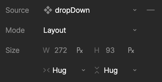
Layout Scale Type
- Fixed - A fixed width or height for the layout. The defined value can be either a point or percentage value. Use the unit toggle within the fields to toggle between value types.
- Hug - The width and/or height of the layout shrinks to fit its children. This is useful if your Component contains text or other objects that need to determine its size.
- Fill - The width and/or height of the layout expands to fill the available space within the parent layout or artboard.