

- Text runs: The content. A text object has one or more runs, each with its own style. Bind a run to a string property to change its content at runtime.
- Text styles: The font, size, spacing, and paint of each run.
- Fonts: The typefaces your styles use, and how much of each font is exported.
- Text modifiers: Animate or transform individual glyphs, words, or lines, or make text follow a path.
- Text input: An editable field that users can type into at runtime.
Creating text
1
Press
T, or select the Text Tool in the toolbar.2
Add the text to the artboard:
- Click to create text that sizes itself to fit its content (Auto Width).
- Click and drag to draw a text box of a set size (Fixed Size).
3
Type your text.
Sizing
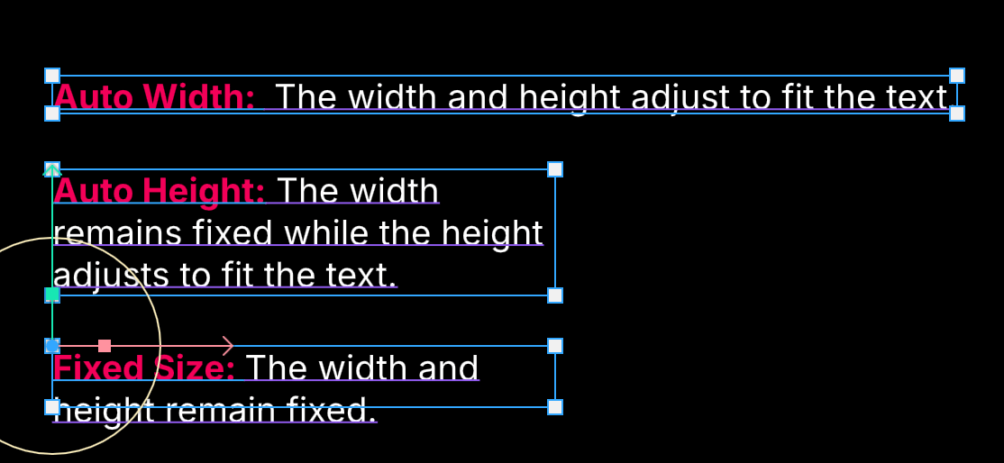
Sizing controls how the text’s bounds respond to its content.- Auto Width: The width and height grow and shrink to fit the text.
- Auto Height: The width stays fixed, and the height grows to fit the text.
- Fixed Size: The width and height stay fixed. Use Overflow to decide what happens when the text doesn’t fit.
Alignment
Horizontal alignment (left, center, right) and vertical alignment (top, middle, bottom) position the text inside its bounds.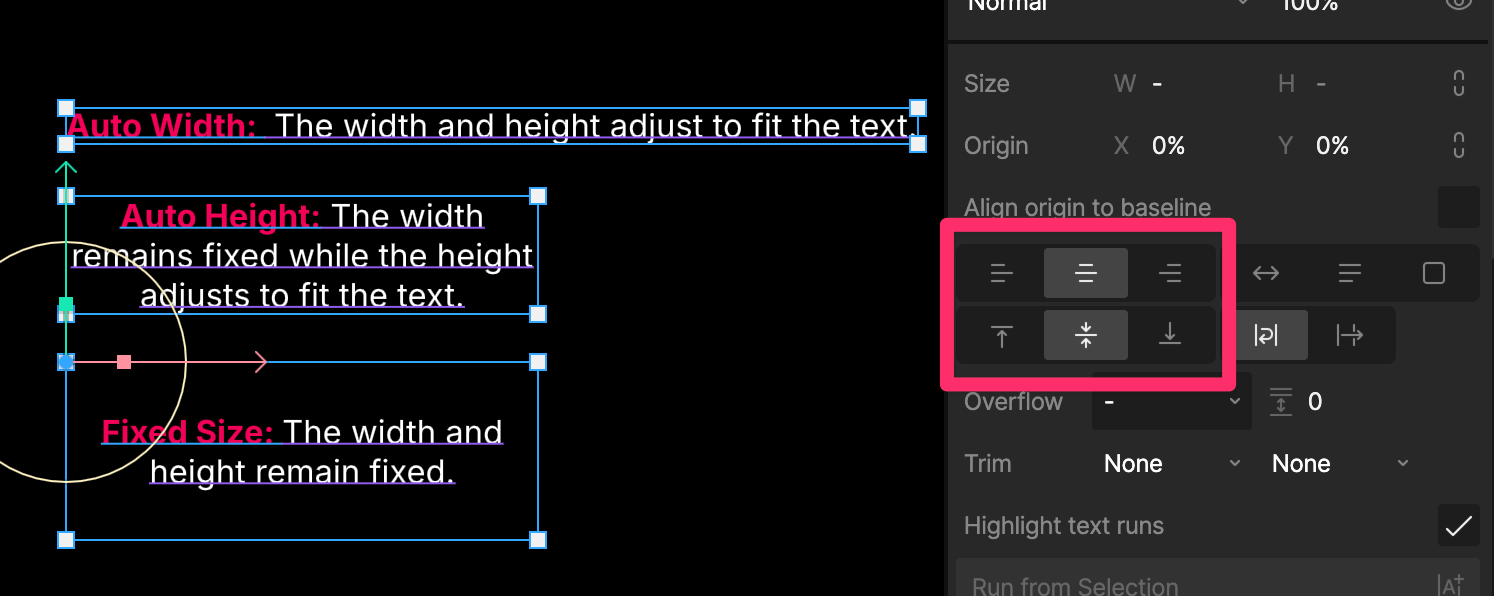
Alignment only has an effect where the bounds are larger than the text. With Auto Width, the bounds always fit the text, so neither alignment changes anything. With Auto Height, vertical alignment doesn’t change anything.
Wrapping
- Wrap moves text to a new line when it reaches the width of its bounds.
- No Wrap keeps each paragraph on a single line.
Break
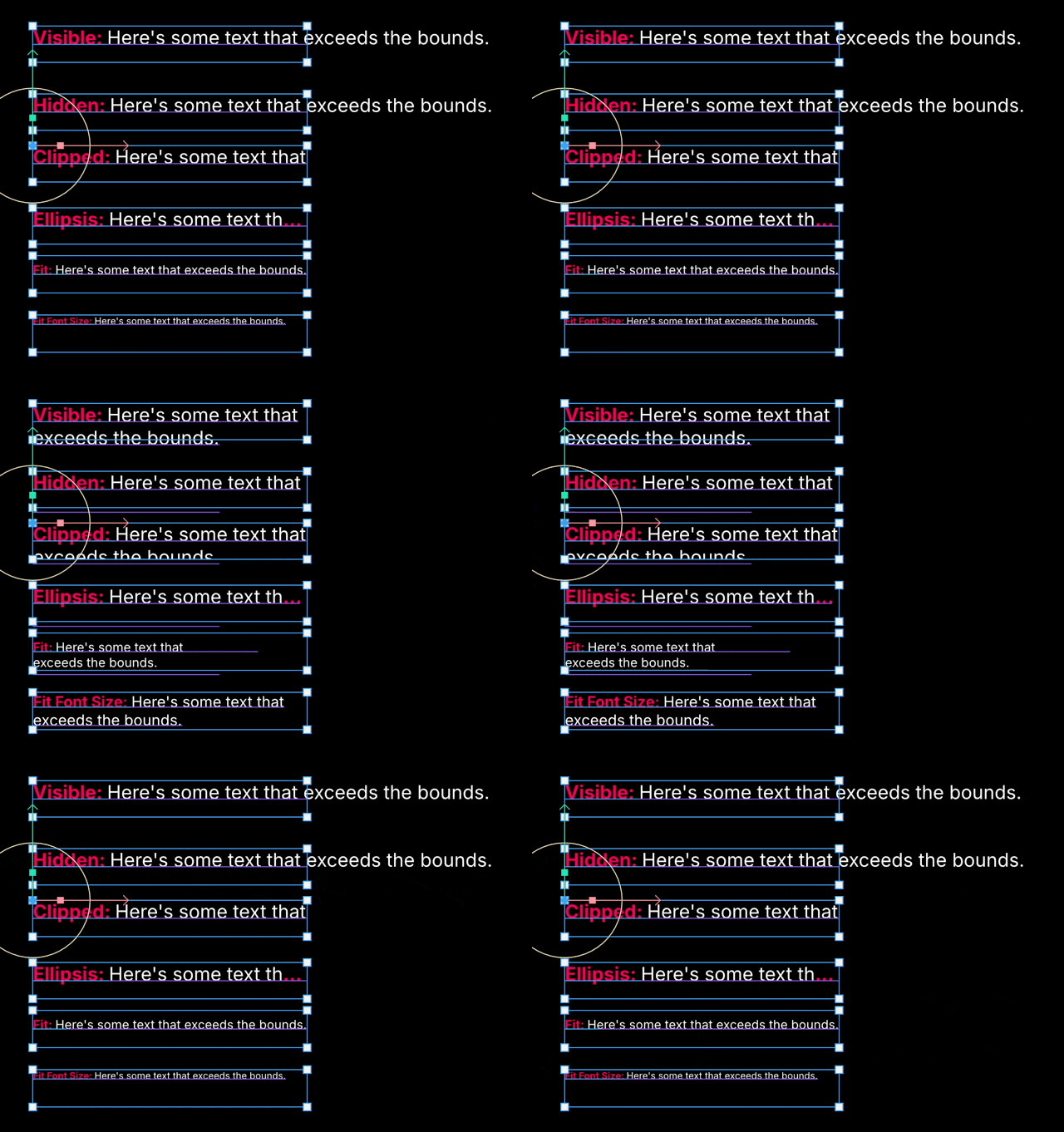
Break decides what happens to a single word that’s too long to fit on a line. It only matters while the text wraps.- Break Word is the default. A word moves to the next line, and is only split if it doesn’t fit on a line by itself.
- Normal never splits a word. A word that’s too long runs past the edge of the bounds.
- Break All splits words wherever the line ends, so every line is filled to the edge.
Overflow
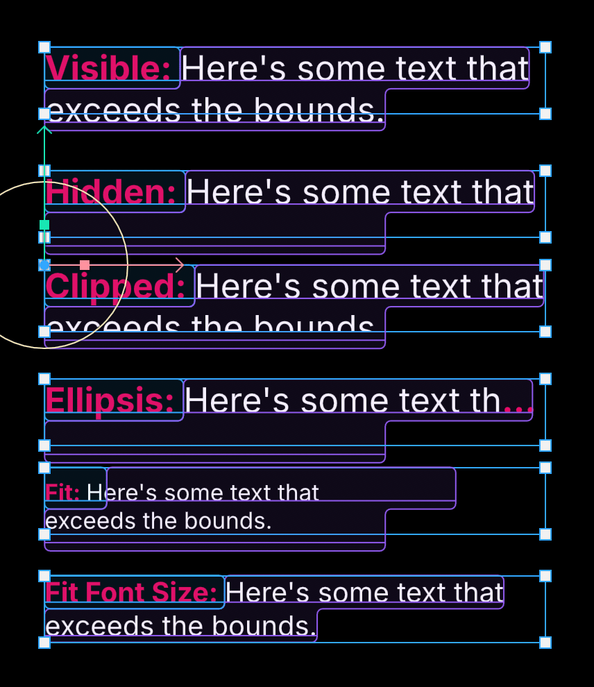
Overflow controls what happens when text in a Fixed Size box doesn’t fit.- Visible: The text runs past the bounds.
- Hidden: Lines that don’t fit are hidden. Partly visible lines are hidden too.
- Clipped: The text is cut off at the bounds, including partly visible lines.
- Ellipsis: The text is cut off and ends with an ellipsis (…). In right-to-left text, the ellipsis appears on the left, where the line ends.
- Fit: The text is scaled down until it fits, keeping its line breaks. Turn on Maintain baseline to keep the first line’s baseline in place as it scales.
- Fit Font Size: The font size is reduced until the text fits, and the text is laid out again at the new size, so its line breaks can change.
Spacing and trim
Paragraph spacing
Paragraph Spacing adds space between paragraphs. To change the space between lines, set the line height in the text style.Trim
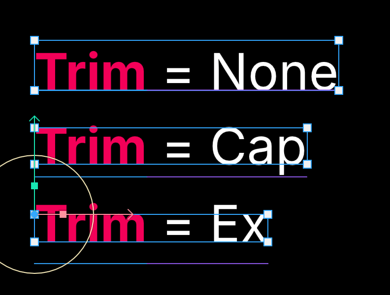
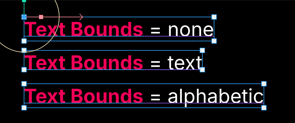
By default, text bounds include the space a font reserves above and below its letters. Trim removes that space, so the bounds hug the letters and the text lines up with other objects more easily. Set the top and bottom separately.- Top:
- None keeps the font’s full height above the text.
- Cap trims to the top of capital letters.
- Ex trims to the top of lowercase letters, such as “x”.
- Bottom:
- None keeps the font’s full depth below the text.
- Alphabetic trims to the baseline, the line the letters sit on.
- Text trims to the bottom of the text, including descenders like “g” and “y”.
Align origin to baseline
Turn on Align origin to baseline to put the text’s origin on the baseline of its first line. This makes it easier to line text up with other objects, or keep its baseline in place as it changes size.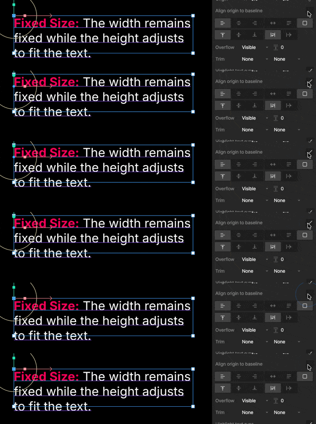
Highlight text runs
Turn on Highlight text runs to tint each run in a different color on the stage, so you can see where one ends and the next begins. It only affects the editor.Flatten to shape
Flatten to Shape converts the text into vector paths that you can edit like any other shape. The result is no longer text, so you can’t edit its content, and any keys on the text are removed.Flattening text can create a lot of geometry. If you’re flattening text to avoid embedding a font, keep it as text instead and export only the glyphs you use.