- Pin items to chosen edges of a parent artboard or container.
- Create buttons and labels that adapt to the size of the text.
- Build lists and grids of content that reflow, animate, and scroll.
- Combine and nest layouts to develop entire interfaces
Check out the Layouts playlist on Rive’s YouTube channel for additional Layout related tutorials
Introduction
Prior to the addition of Layouts in Rive, all objects on an Artboard were positioned in a freeform way, with few rules limiting this (one exception being Constraints). Layouts provide a rules based way to position and size your content using Rows and Columns.Layout Parents and Children
In order to create more complex UI that responds to the screen or browser size, it is important to understand that Layouts can be placed inside other Layouts. We refer to the outer Layout as the parent and the inner Layout as the child. The Layout children are typically positioned relative to their Layout parent (similar to how Groups work). In addition, the parent can either be sized to the children (Hug) or the children can size to their parent (Fill). Here is an example to help visualize how these relationships work. In the image below we will focus on the regions contained by the dashed lines. The outer green dashed line is the outermost Layout, which is set to Layout its children in a single Column. In the second row of that Column, the red dashed line is a child Layout containing the Battery indicators for various devices. This Layout is defined as a Row. This Layout has 4 child Layouts (blue dashed) set to evenly Fill the width of their parent (so that when the parent resizes, the child Layouts also resize, each to Fill 25% of the available space). Each of those 4 Layouts are set to Column and have 2 child Layouts (pink dashed) containing a trim path with a visualization of battery remaining and percentage label. By creating these simple parent-child Layouts, we can create infinitely responsive content with Rive!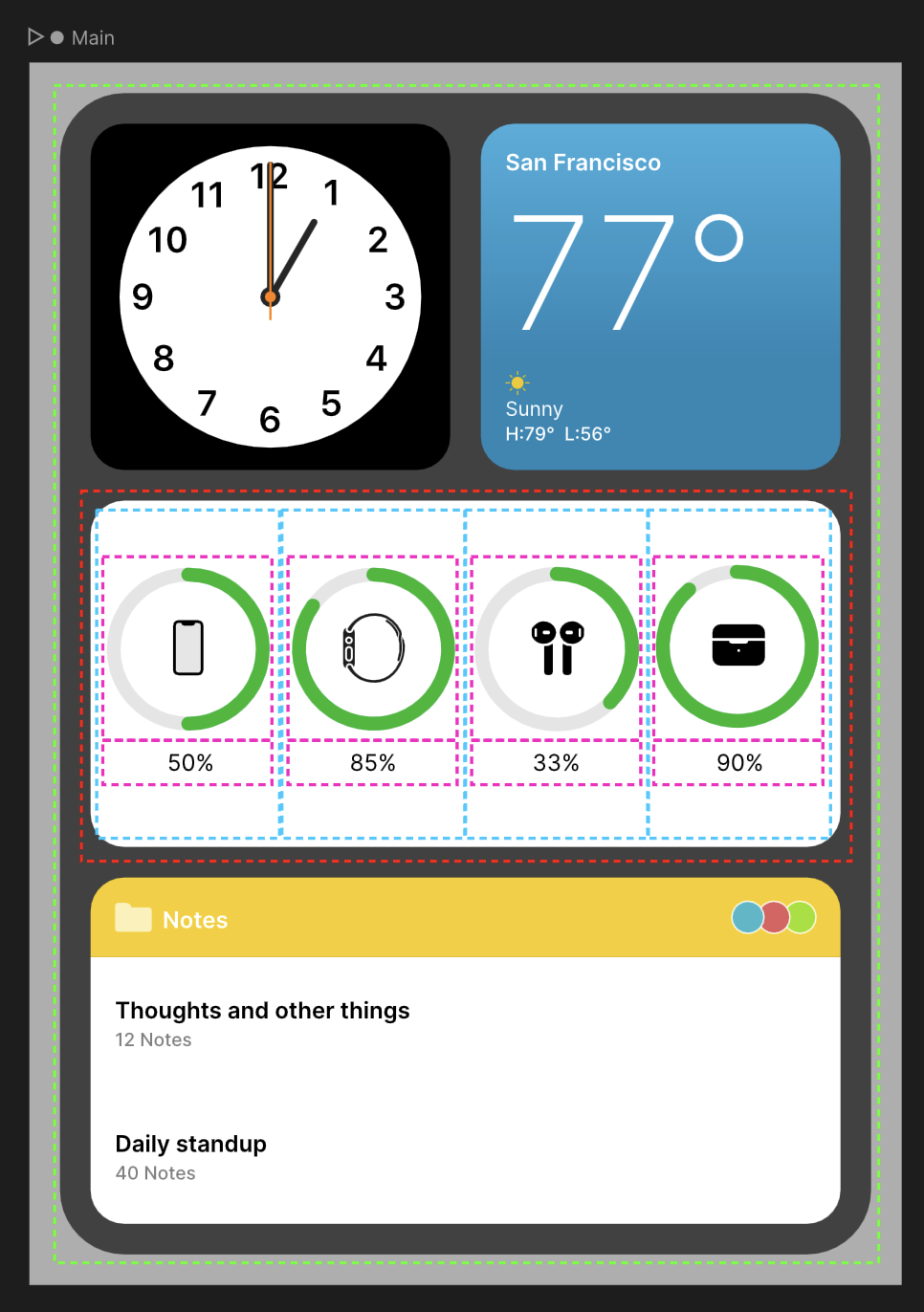
Absolute vs Relative Layouts
Layouts can exist within Rive’s freeform transform space, which means that you can draw a Layout to the Artboard and position it as you would any other Rive object. This type of Layout is referred to as Absolute (positioned absolutely). On the other hand, when you want a Layout to participate in the flow of its parent layout, this is referred to as Relative (positioned relative to its parent). The position of Relative Layouts are determined by their parent via many parameters such as Row/Column, alignment, padding, gap, etc. Use the icon in the top right of the layout inspector to toggle between an absolute and relative layout.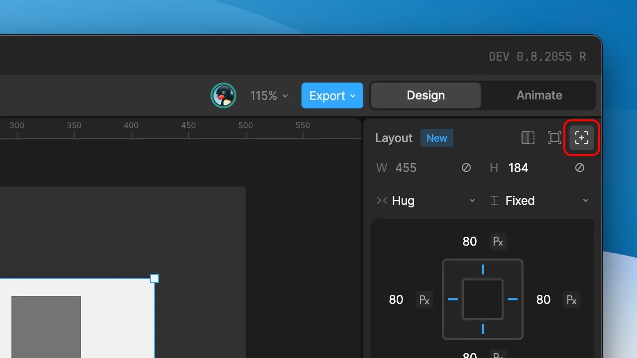
Layouts and other Rive objects
A Layout container will affect its children in one of two ways:- Set the child’s position
- Set both the child’s position and size
- Text
- Images
- Parametric shapes (rectangles, ellipses, triangles, polygons, and stars)
- Component instances (Leaf & Layout mode)
- Other Layouts
Use cases
Building a Responsive Button
This tutorial shows how you can build a responsive button from scratch.Reflow With Dynamic Components
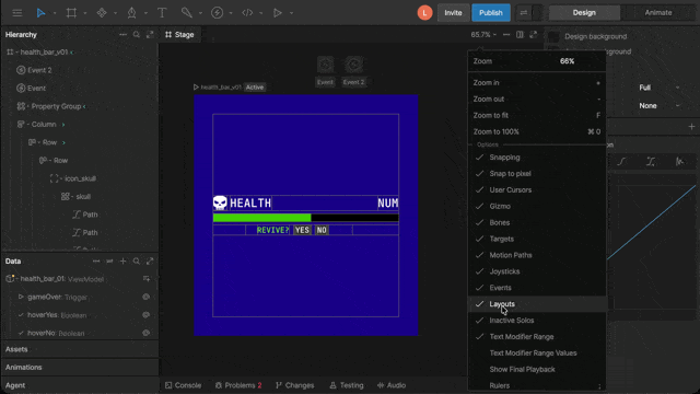
This tutorial explains how to build Rive files that can reposition their elements dynamically when resized.If layouts aren’t visible on the stage, open the View Options menu and make sure Layouts is enabled.