Absolute vs Relative
To control the flow of child Layouts in a Row or Column requires the Layout children to be Relative, i.e. not have their Absolute position option enabled. Use the icon in the top right of the Layout inspector to toggle between an Absolute and Relative Layout.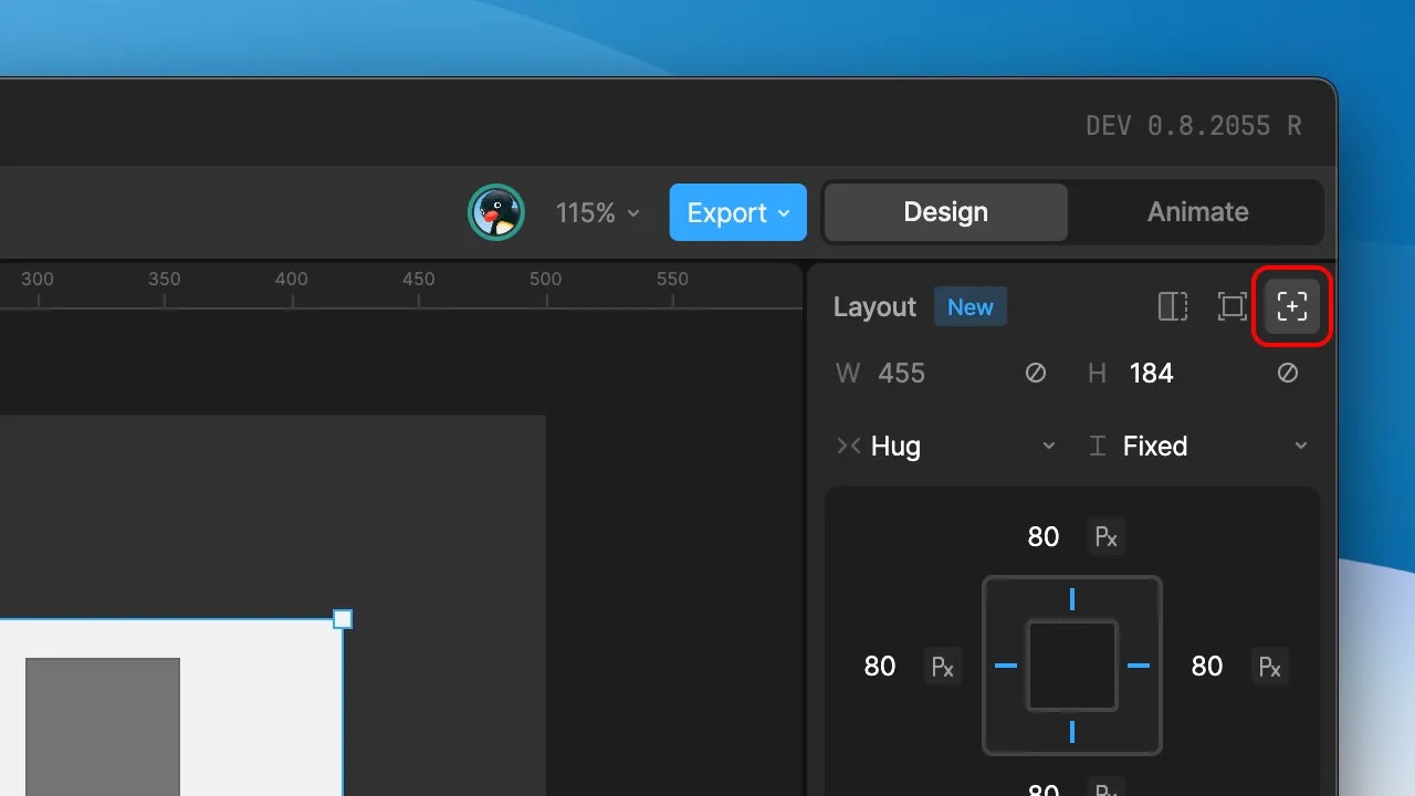
- Absolute: An Absolute Layout positions itself within an artboard or parent Layout container. It can have 2 or more of it’s edges pinned to the container.
- Relative: A Relative Layout has it’s position defined by the parent artboard or Layout. Changing the flex properties on the parent will determine the child layout behaviour.
Scale Types
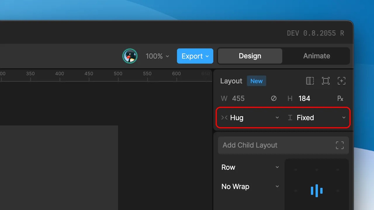
A layout’s width and height can make use of 3 different scale behaviours:- Fixed: A fixed width or height for the Layout. The defined value can be either a point or percentage value. Use the unit toggle within the fields to toggle between value types.
- Hug: The width and/or height of the Layout shrinks to fit its children. For example, you may want a Layout to hug a text object; resizing itself based on the length of the text inside.
- Fill: The width and/or height of the Layout expands to fill the available space within the parent Layout or artboard. The fill option switches the width/height fields to be represented in
fr(fill ratio) units and reveals a base size field. The fill ratio values make it possible to control the fill behaviour between a number of children with the fill scale behaviour. For example, you may want the children to fill the available space equally, or perhaps have one child scale at a greater factor than the rest.
Hug and Fill options will only surface when applicable. For example, a Layout without any children won’t surface the option to hug, while only a Layout with another Layout as its parent can be set to Fill.
Size constraints
Use the icon above the absolute toggle to add minimum and/or maximum width and height values. As with the width and height values themselves, these can be defined as either points or percentages.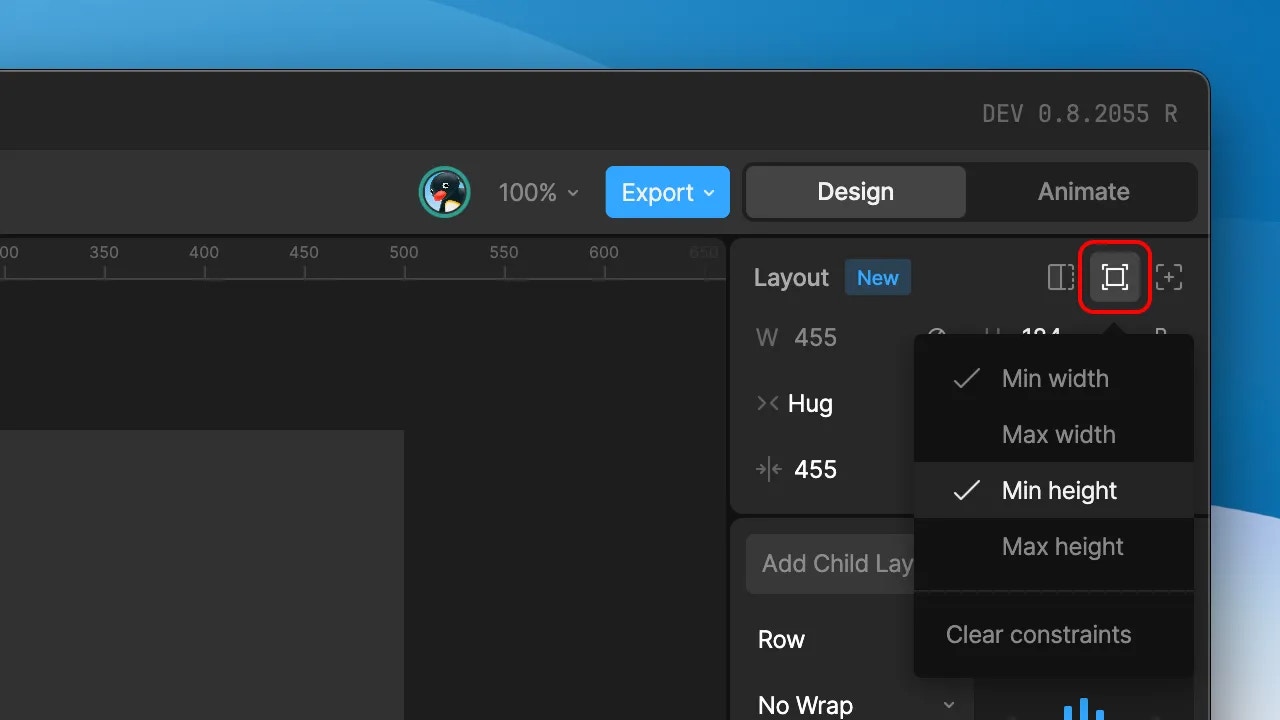
Clip
The clip toggle hides any child elements within the layout that extend beyond the bounds of the Layout.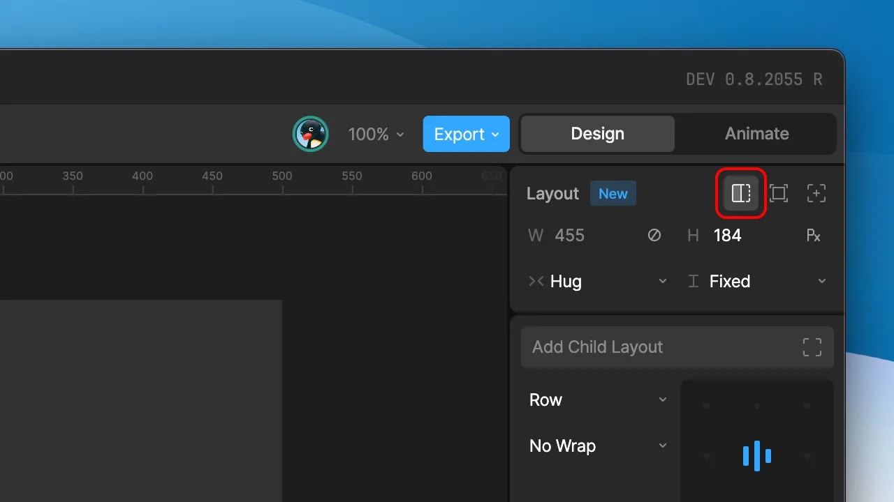
Position (Absolute Layouts only)
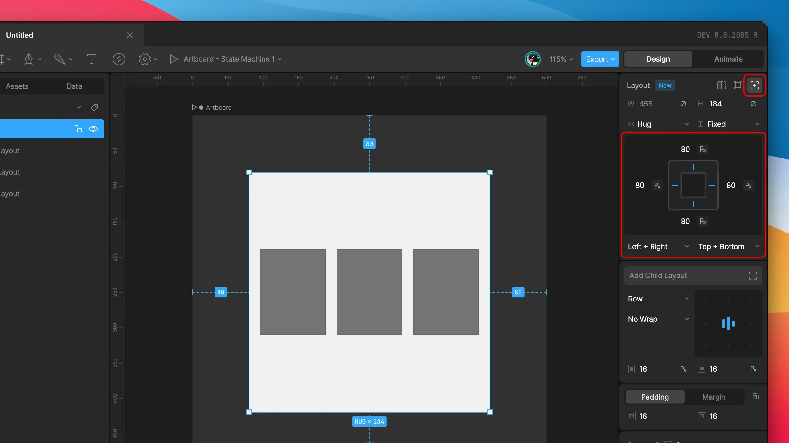
Absolute Layouts provide additional options to set their position within the artboard or parent Layout. The position is defined by at least 2 pinned edges — one horizontal and one vertical, however additional edges can also be enabled. Set the desired edges to pin by selecting the markers within the inspector graphic, or via the fields below. You can holdshift while selecting a marker to add a second edge along the same axis. The distance values from a chosen edge can be provided as points or percentages by selecting the chosen unit type within the field.
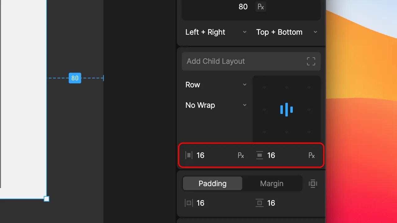
Padding and Margin
Padding ONLY affects Layout children. For example if you want to have a button with a label, the text should be wrapped in a Layout and that Layout should be the child of another Layout that applies the padding.
Margin affects the Layout to which the margin is applied relative to its parent Layout.
- Padding: Inner space between the Layout bounds and any relative Layout children.
- Margin: Outer space between the Layout bounds and a relative parent Layout.
Layout Children
A layout’s flex parameters are only applied to other layouts contained within it. In order to generate rows, columns, and grids of content that reflow, content items must themselves be wrapped in an additional layout container.
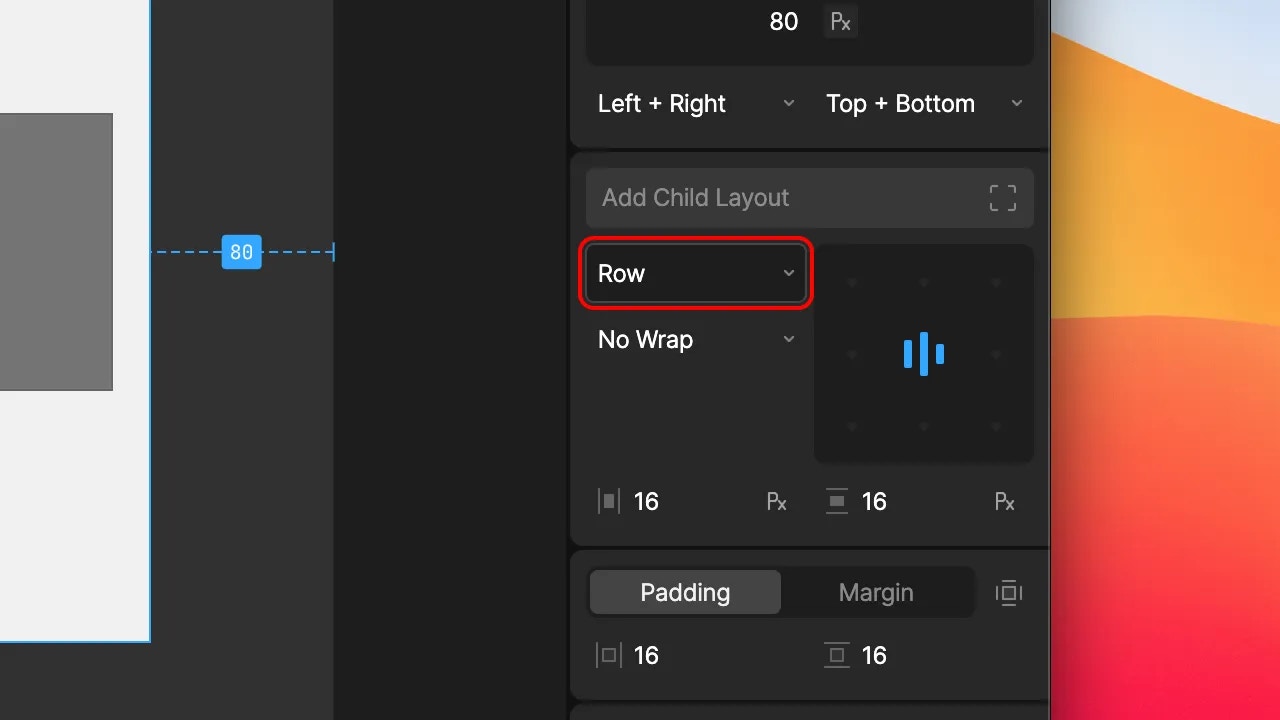
Row/Column
- Row: Lay out children along the horizontal axis.
- Column: Layout children along the vertical axis.
- Row Reverse: Lay out children horizontally, in reverse order.
- Column Reverse: Lay out children vertically, in reverse order.
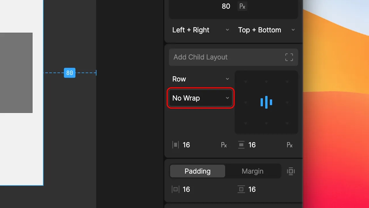
Wrap
- No Wrap: When the content reaches the bounds of the layout, continue to extend beyond it.
- Wrap: When the content reached the bounds of the layout, place the next item on below or alongside the currently row/column.
- Wrap Reverse: Same as wrap, but display the content in reverse order.
Alignment
Select the desired point on the inspector widget to align content within a layout container.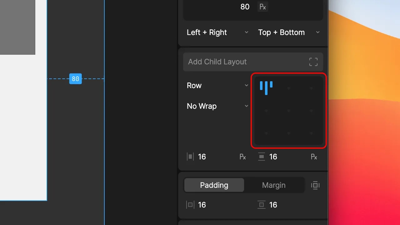
Justify
Click on the current alignment position to expand the content to fill the available space. Selecting the one of the active tiles again collapses the content back down.Gap
Spacing between content (gaps) can be set both horizontally and vertically, and as either points or percentages of the container width/height.