Setting Up a Component for Stateful Use
Before a component can be used statefully, its artboard needs a view model with the properties you want to expose.- Create or open the artboard you want to use as a component.
- Add a view model and bind the relevant properties to elements in the artboard (for example, a label string bound to a text run, or a background color bound to a fill).
- Mark the artboard as a component using the component toggle in the inspector, or press Shift + N.
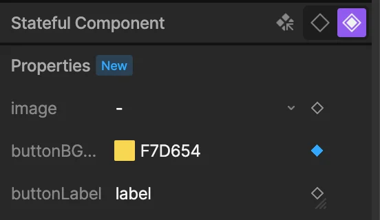
- In the inspector, find the Properties section. Click + to add the view model properties you want to expose.
- For each property, choose whether it’s an Input or an Output:
- Input — the value can be set on each instance when nested as a stateful component.
- Output — the value is read-only when nested; it reports back to the parent.
Using a Stateful Component
When you nest a component (press N and select it from the menu), it comes in as a stateless component by default. Switch it to a stateful component in the inspector.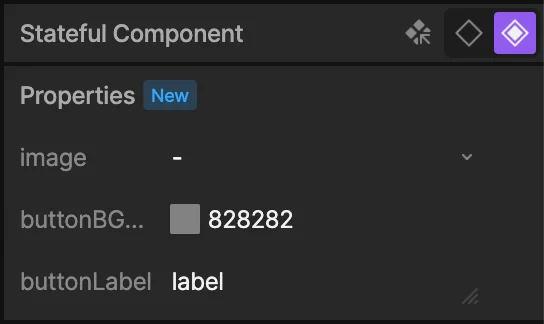
Nesting Stateful Components
Stateful components can be nested inside other components. For example, a card component might contain a stateful button component. If you want the card’s parent to be able to override the button’s properties, add those properties to the card’s view model and data bind them to the button’s stateful properties. Once added to the card’s Properties panel as inputs, they’ll be available to override when the card is nested.Output Properties
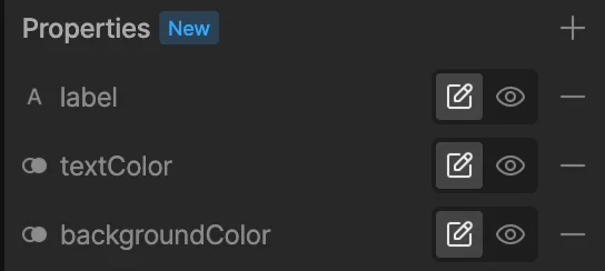
Output properties report a value out of a component when it’s nested. They appear with a lock icon in the inspector and are marked as read-only — you can interact with the component, but you can’t set the value from outside.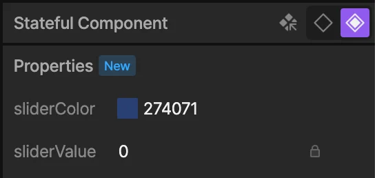
Keying Input Properties on Timelines
Input properties can be keyed on a timeline. Open the timeline view with a stateful component selected and you’ll see a key indicator next to each exposed input property. Key the values at different points in the timeline to animate them.