
Hey, I’m Daire O Suilleabhain, a motion designer in Edinburgh who’s passionate about accessibility.
(Editor’s note: Check out his Beard Trimmings Substack for relatable rants on motion design.)
At a recent accessibility conference, Access:Given, I was reminded that audiobooks were originally invented for people with visual impairments. These days, everyone listens to them. That’s what good accessibility does: it makes design better for all.
For years, accessibility in online animation has been falling behind. The only accommodation for people with disabilities usually began and ended with subtitles. While subtitles are a great step and have been proven to increase viewership, they’re not without drawbacks. From speaking with accessibility experts, I learned that embedded subtitles, or baked-in as they’re known in videoworld, can’t be read by screen readers. That means all your storytelling is invisible to them.
Now that I’m designing with Rive, I’ve started rethinking motion entirely. Rive’s interactive nature — animations that live in the DOM instead of being baked into a video — opens new doors for accessible motion. You can adjust color, speed, and interaction dynamically. The barrier between motion and usability is finally starting to break down.
A quick word on WCAG and why it matters for us
The Web Content Accessibility Guidelines (WCAG) set the standard for making the web usable for everyone. They’re divided into three levels: A (minimum), AA (recommended), and AAA (gold standard).
AAA-level compliance might sound out of reach for animation — and even by WCAG’s own admission, making a website AAA compliant is very tough. But that doesn’t mean we shouldn’t at least try. Many WCAG principles, especially those around motion, contrast, and input, are surprisingly achievable in Rive.
And with the European Accessibility Act coming into effect in 2025, accessible design isn’t just good practice. It’s a legal requirement for many digital products in the EU. It’s worth familiarizing yourself now.
Rive workflows that support accessibility
Rive’s team is actively exploring how to bake accessibility into the Editor, things like semantic roles, labels, and navigation order that carry through to the runtime. The goal is for developers to take that information directly from the .riv file without having to rebuild logic manually. If you're willing to do the work, you can manually do some of this today with Data Binding. You need to create the semantic information yourself at runtime by reading the data-bound values.
In the meantime, here are a few things we can do today:
Bind colors to contrast-friendly palettes
Respect reduced-motion preferences
Keep motion readable and intentional
Label and structure your animations clearly.
Data Binding for color contrast
I’d recommend using Data Binding in Rive for your colors. That way, you can update them for contrast without drilling down into your design. Bind your colors to a Color Property in a View Model, and both you and your developer will have easy control over hue.
This came in handy when I was updating my website and had a shiny new color palette. Initially, I had bright yellow on a red background. To me, it looked good. But after using a color-contrast checker* just to be sure, I was baffled to see those two colors failed AA and AAA compliance.
I swapped the colors easily with Data Binding and voila! AA and AAA pass. I was pleasantly surprised with the updated palette, but I’m really glad I checked. It’s a stronger design choice and one that’s accessible to everyone.
*There are loads of color-contrast checkers online to choose from. Keep one bookmarked. It’ll save you time later!
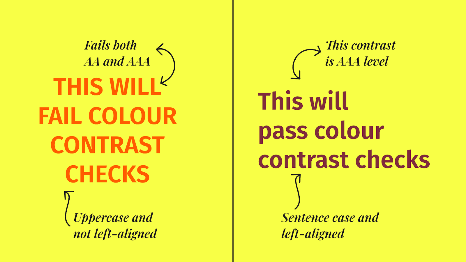
[IMAGE DESCRIPTION: A large yellow rectangle is divided into two. On the left, large red text reads “THIS WILL FAIL COLOUR CONTRAST CHECKS”. An arrow pointing to smaller text above reads “Fails both AA and AAA”. Another arrow below points to text that reads “Uppercase and not left-aligned”. On the right side, large purple text reads “This will pass colour contrast checks”. An arrow points to smaller text above that reads “This contrast is AAA level”. Another arrow points to text below that reads "Sentence case and left-aligned.]
Text and layouts that scale
Wrap your text in a Layout. If the color contrast between text and background isn’t great, you can add a background color to the layout. It’ll always fit the text automatically. It keeps things readable and flexible at any zoom level or resolution.
Use 14pt minimum and keep your text left-aligned. You can also center-align if you have to, but fully justified text is a bad option. You just can’t justify it… (I know, I know, terrible joke.) Data Binding and Rive Text lets you localize for different languages, which aren’t always left-aligned.
Draw Order for clarity
You're halfway through a project when you notice an important bit of text is getting blocked by an animated element. And reordering in the hierarchy could add more problems to your setup.
That’s where Draw Order comes in handy. You can set it so that a shape or text layer always appears above (or below) another. Just remember to target the actual layer, not a group.
It’s a small thing, but it keeps vital information from disappearing mid-animation. And it saves a lot of headaches later.
Controlling motion with State Machines
Think about whether your animations really need to autoplay. Is it essential to the experience?
In Rive, you can let users start or stop an animation themselves by combining triggers in your View Model with the playback speed of timelines in the State Machine. Setting a timeline’s playback to 0x gives the user full control.
This aligns with WCAG’s Animation from Interactions guideline (2.3.3), which is AAA level. With a simple addition in Rive, we can hit an AAA!
Keep your animation at 60fps. The default framerate of 60fps in Rive already looks buttery smooth, but it also helps reduce jitter or motion blur. People with additional needs can find fast or erratic motion overwhelming. Not making people feel sick is the least we can do with our animations.
If your animation includes flashing elements, keep it to three flashes or fewer per second, or less than 25% of the view area. If you're using the default framerate of 60fps in Rive, that’s one flash per 20 frames. Stick to that and you can meet WCAG’s Three Flashes criteria (2.3.2) — another AAA-level win.
Buttons that make sense
Buttons should be at least 24x24 pixels, though I usually go bigger. Consider screen density — 24x24 pixels is much smaller on HDPI displays. If you’ve created your button with Layouts, just add Padding to create that extra space. It makes them easier to hit and harder to miss.
Making accessibility part of the design process
Rive already gives us a head start: it’s vector-based, responsive, and data-driven by nature. The real magic happens when we think about accessibility early on, not as an afterthought.
It might feel like extra work at first, but it genuinely makes your designs stronger. Accessibility is an opportunity to be more thoughtful and precise. The more I build in Rive, the more I see that accessibility and creativity go hand in hand.
Join our newsletter
Get all the latest Rive news delivered to your inbox.