> ## Documentation Index
> Fetch the complete documentation index at: https://rive.app/docs/llms.txt
> Use this file to discover all available pages before exploring further.
# Component Sizing
> Control how component instances scale, fit, and reflow within their parent.
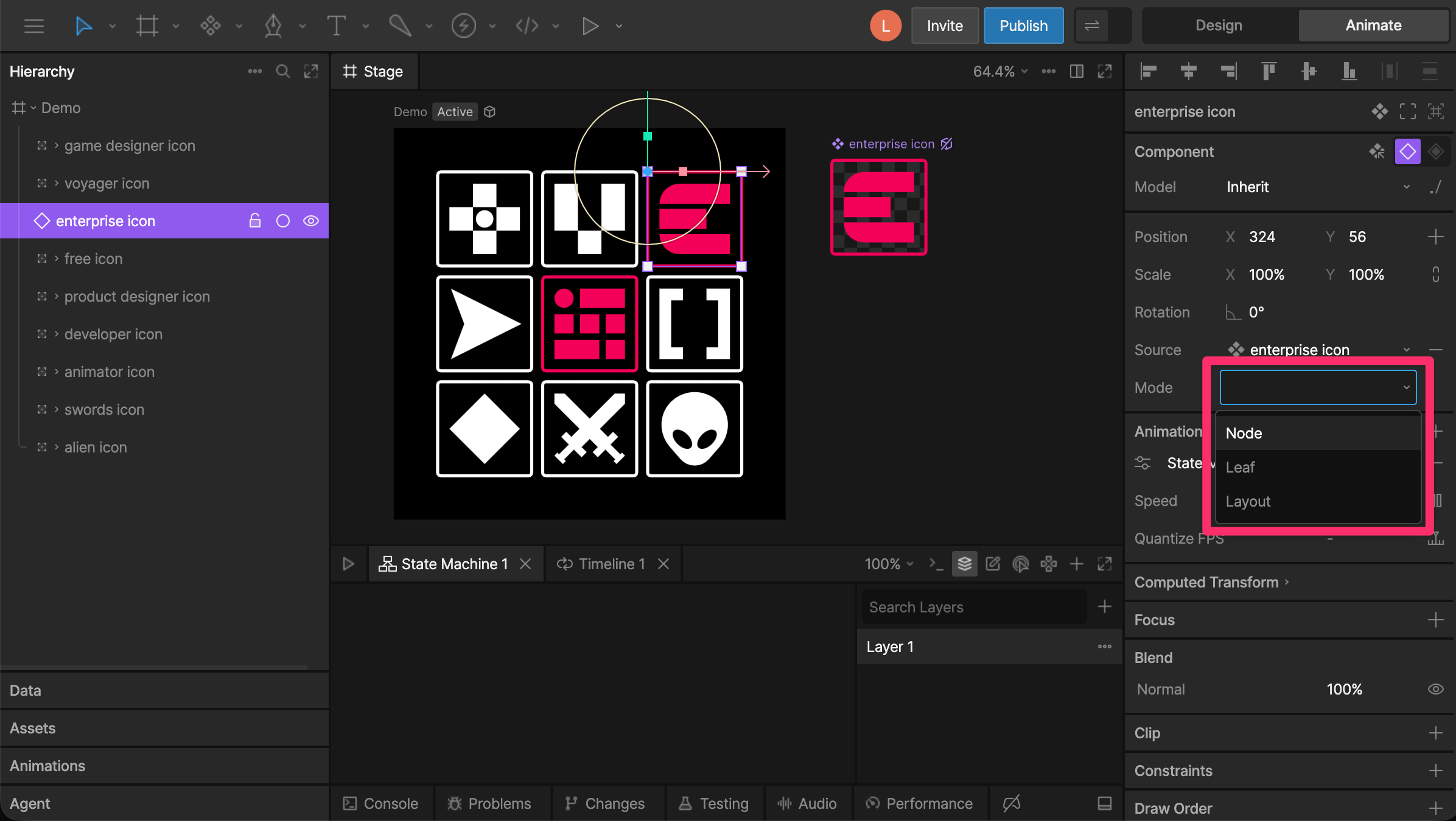
Component sizing determines how a component instance responds to the space available from its parent. Choose a sizing mode based on how you want the component and its contents to respond as that space changes.
* **Node** - Scale the component as a single object.
* **Leaf** - Fit the component's contents within the available space.
* **Layout** - Resize the component's artboard, allowing its contents to reflow.
 ## Node
**Node** is the default sizing mode. The component behaves like a regular object or group, with its contents scaling together based on the **Scale** property.
Use Node when the component doesn't need to respond to the size of a parent Layout.
## Leaf
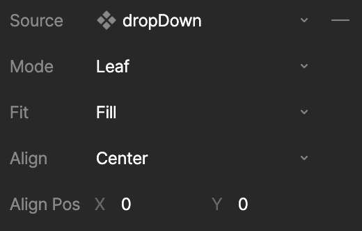
**Leaf** fits a component's contents within the space provided by its parent Layout or artboard. The component's contents scale rather than reflow.
Leaf is useful for responsive components that don't contain Layouts themselves, such as an illustration or icon that needs to fit within the available space.
## Node
**Node** is the default sizing mode. The component behaves like a regular object or group, with its contents scaling together based on the **Scale** property.
Use Node when the component doesn't need to respond to the size of a parent Layout.
## Leaf
**Leaf** fits a component's contents within the space provided by its parent Layout or artboard. The component's contents scale rather than reflow.
Leaf is useful for responsive components that don't contain Layouts themselves, such as an illustration or icon that needs to fit within the available space.
 ### Fit
**Fit** determines how the component's contents scale within the available space.
* **Fill (Default)** - Fill the available space. If the aspect ratios differ, the content stretches to fit.
* **Contain** - Fit all content within the available space while preserving its aspect ratio. This may leave unused space.
* **Cover** - Fill the available space while preserving the content's aspect ratio. Some content may extend beyond the available space.
* **Fit Width** - Scale the content to the width of the available space. This may result in clipping or unused space vertically.
* **Fit Height** - Scale the content to the height of the available space. This may result in clipping or unused space horizontally.
* **None** - Keep the content at the original size of its artboard. This may result in clipping or unused space.
* **Scale Down** - Scale the content down to fit while preserving its aspect ratio, but don't scale it up when the available space is larger.
### Alignment
**Alignment** determines where the component's contents are positioned when they don't fill the available space. Choose from nine positions using the alignment grid, including center, corners, and edges.
For more precise positioning, use **Alignment Position X/Y**. Values range from `-1` to `1` on each axis:
* **X:** `-1` is left, `0` is center, and `1` is right.
* **Y:** `-1` is top, `0` is center, and `1` is bottom.
You can also use values between these positions. For example, an X value of `0.5` positions the content halfway between center and right.
## Layout
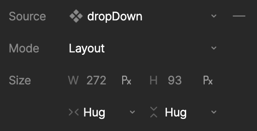
**Layout** resizes the component's artboard instead of scaling its contents. As the artboard changes size, Layouts within the component can reflow their contents to respond to the available space.
Use Layout for responsive components whose internal content needs to resize or reflow, such as buttons that hug their text or components that fill the width of a parent Layout.
### Fit
**Fit** determines how the component's contents scale within the available space.
* **Fill (Default)** - Fill the available space. If the aspect ratios differ, the content stretches to fit.
* **Contain** - Fit all content within the available space while preserving its aspect ratio. This may leave unused space.
* **Cover** - Fill the available space while preserving the content's aspect ratio. Some content may extend beyond the available space.
* **Fit Width** - Scale the content to the width of the available space. This may result in clipping or unused space vertically.
* **Fit Height** - Scale the content to the height of the available space. This may result in clipping or unused space horizontally.
* **None** - Keep the content at the original size of its artboard. This may result in clipping or unused space.
* **Scale Down** - Scale the content down to fit while preserving its aspect ratio, but don't scale it up when the available space is larger.
### Alignment
**Alignment** determines where the component's contents are positioned when they don't fill the available space. Choose from nine positions using the alignment grid, including center, corners, and edges.
For more precise positioning, use **Alignment Position X/Y**. Values range from `-1` to `1` on each axis:
* **X:** `-1` is left, `0` is center, and `1` is right.
* **Y:** `-1` is top, `0` is center, and `1` is bottom.
You can also use values between these positions. For example, an X value of `0.5` positions the content halfway between center and right.
## Layout
**Layout** resizes the component's artboard instead of scaling its contents. As the artboard changes size, Layouts within the component can reflow their contents to respond to the available space.
Use Layout for responsive components whose internal content needs to resize or reflow, such as buttons that hug their text or components that fill the width of a parent Layout.
 ### Size
In Layout mode, the component's width and height can each use one of three sizing behaviors:
* **Fixed** - Use a defined width or height. Fixed dimensions can use either units or percentage values.
* **Hug** - Resize to fit the component's contents. This is useful when content such as text needs to determine the component's size.
* **Fill** - Expand to fill the available space within the parent Layout or artboard.
When using **Fixed**, enter a value for the component's width or height and use the unit control to switch between units and percentages.
Unlike the **Scale** property, changing the size of a component in Layout mode changes the dimensions of its artboard and allows its contents to reflow. In most cases, avoid using **Scale** with components in Layout mode.
### Size
In Layout mode, the component's width and height can each use one of three sizing behaviors:
* **Fixed** - Use a defined width or height. Fixed dimensions can use either units or percentage values.
* **Hug** - Resize to fit the component's contents. This is useful when content such as text needs to determine the component's size.
* **Fill** - Expand to fill the available space within the parent Layout or artboard.
When using **Fixed**, enter a value for the component's width or height and use the unit control to switch between units and percentages.
Unlike the **Scale** property, changing the size of a component in Layout mode changes the dimensions of its artboard and allows its contents to reflow. In most cases, avoid using **Scale** with components in Layout mode.